Break away from the traditional text-image or image-text layouts and get some Elementor Layout Ideas. By using containers and Flexbox, we can design more engaging and visually stimulating designs. Web Squadron will show you some interesting layouts to freshen up your website.
12 Elementor Layout Ideas
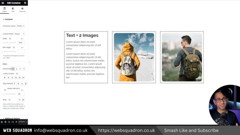
- Text + 2 Images
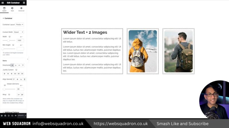
- Wider Text + 2 Images
- Text with Images + 2 Images

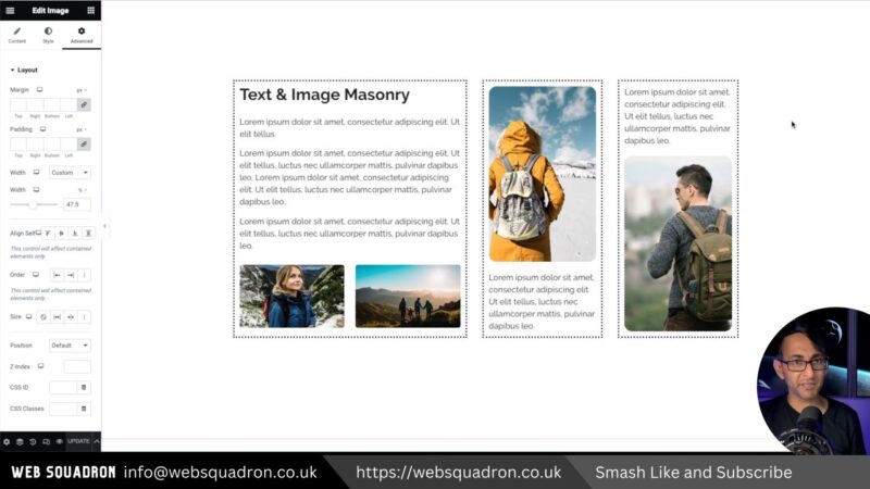
- Text & Image Masonry
- Text & Image Metro

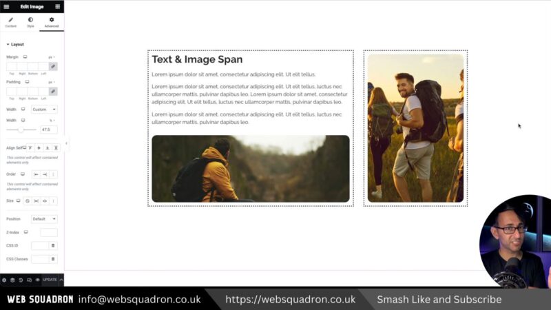
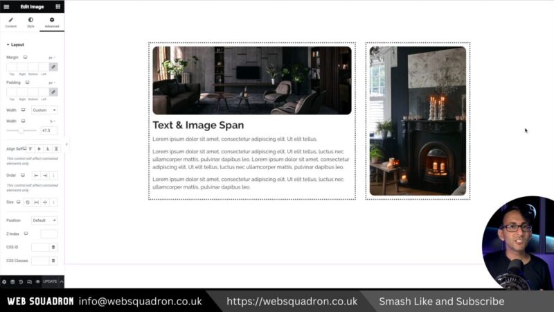
- Text & Image Span
- Text & Image Span Flipped
- Text & Images

- Text with End Image

- Inside the Background

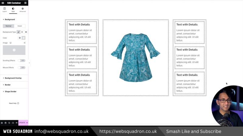
- Multiple Texts + 1 Image
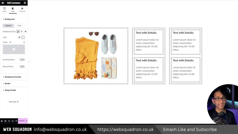
- Multiple Texts + 1 Image Variation


The Benefits of Unique Layouts
Unique Elementor Layout Ideas offer a number of benefits. Firstly, they provide a fresh, engaging user experience. By breaking away from traditional layout patterns, you can capture your audience’s attention and keep them engaged with your content.
Secondly, unique layouts allow you to present your content in a way that best suits your message. Whether you’re showcasing a product, explaining a concept, or telling a story, there’s a layout design that can help you communicate your message effectively.
Finally, unique layouts can help differentiate your website from the competition. In a world where many websites look the same, a unique layout can help your site stand out from the crowd.
Tips for Implementing Unique Elementor Layouts Ideas
- Consider Your Content
The best layout for your website will depend on the type of content you’re presenting. Consider the nature of your content and choose a layout that best supports it. - Keep It Balanced
While it’s great to experiment with unique layouts, it’s important to maintain balance on your page. Too many images can overwhelm the reader, while too much text can be daunting. Aim for a balance that keeps your content engaging and easy to digest. - Test and Iterate
Don’t be afraid to experiment with different layouts. Test different designs, gather feedback, and iterate on your layouts to find what works best for your audience.
Common Issues and Solutions
- Overwhelming the Reader
Too many images or blocks of text can overwhelm the reader. To avoid this, try to maintain a balance between text and images. Use white space effectively to break up your content and make it easier to digest. - Misalignment of Elements
Sometimes, elements in your layout may not align properly, causing your design to look unprofessional. To fix this, ensure that all elements in your layout are properly aligned using the alignment tools in your web design software. - Inconsistent Design
If you’re using multiple unique layouts on your website, it’s important to maintain a consistent design language. This includes consistent use of colors, fonts, and design elements. If your designs are inconsistent, it can confuse your readers and make your website look unprofessional.
