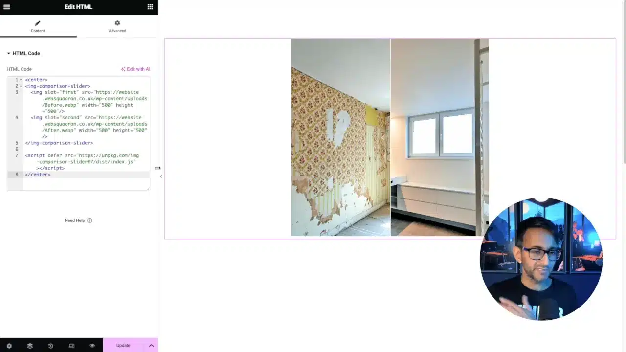
In this tutorial, we’ll learn how to create an Elementor Before and After Slider. This feature allows users to compare two images side-by-side with the ability to slide between them, providing a clear before and after perspective.
Prerequisites
Please make sure you have the following installed and activated:
Creating the Elementor Before and After Slider
- Create a blank page in Elementor and insert a container.
- Drag an HTML widget into your container.
- Insert the following code into the HTML widget:
<! --Sourced from: https://img-comparison-slider.sneas.io/-->
<img-comparison-slider>
  <img slot="first" src="https://staging14.websquadron.co.uk/wp-content/uploads/Mid028.webp" width="600" height="600"/>
  <img slot="second" src="https://staging14.websquadron.co.uk/wp-content/uploads/Mid027.webp" width="600" height="600"/>
</img-comparison-slider>
<script
  defer
  src="https://unpkg.com/img-comparison-slider@7/dist/index.js"
></script>
Source: WebSquadron
- Ensure proper alignment by including
Center Centerin your CSS. - Modify the slider to be vertical or horizontal, and add labels if desired.
- Replace placeholders (e.g. https://staging14.websquadron.co.uk/wp-content/uploads/Mid028.webp) with URLs for your before and after images.
- Define the width and height for both images to ensure they match.
- Click Update and preview the slider on the live page.
Supplementary Resources
Elementor Before and After Slider – Conclusion
With these steps, you’ve created a responsive before and after slider in Elementor, enhancing your website’s interactivity without the need for additional plugins.


