Discover when to use CSS grid in GenerateBlocks over flexbox, where some designs might be difficult to realize with. In the latest updates to GenerateBlocks and GenerateBlocks Pro, CSS Grid has been seamlessly integrated into the editor, making it easier than ever to implement complex designs directly within WordPress. If you’ve been relying on Flexbox, it’s time to see what CSS Grid can do differently, especially in scenarios where Flexbox falls short.
Prerequisites
Please make sure you have the following installed and activated:
CSS Grid vs Flexbox
When designing layouts for the web, two of the most powerful CSS technologies at your disposal are CSS Grid and Flexbox. While both are used for layout creation, they have distinct strengths and are suited to different types of design challenges. Understanding the differences between CSS Grid and Flexbox can help you decide which to use when building your web projects.
| Feature | CSS Grid | Flexbox |
|---|---|---|
| Dimension | Two-dimensional (rows and columns) | One-dimensional (either rows or columns) |
| Use Case | Best for complex grid layouts where control over both rows and columns is needed. | Best for linear layouts where control over either rows or columns is sufficient. |
| Content vs Container | Container-driven. The layout is largely influenced by the grid container’s setup. | Content-driven. The layout adjusts based on the content’s size and space. |
| Alignment | Offers more comprehensive alignment capabilities, controlling both axes easily. | Simplifies alignment along one axis but can be less intuitive when aligning perpendicular to the main axis. |
| Sizing | Allows for explicit sizing tracks, making it ideal for more rigid designs. | Flex items can grow and shrink, making it ideal for flexible layouts. |
| Gaps | Native gap support without affecting outer margins. | Requires additional CSS for spacing between items without affecting outer margins. |
| Nested Layouts | Perfect for creating complex nested grids with consistent alignment. | Suitable for nested layouts but may require more configurations for alignment. |
| Browser Support | Broad support, but older browsers might have inconsistencies. | Excellent support, including older browsers with fallback considerations. |
When to Use CSS Grid in GenerateBlocks – Video Chapter Summary
- 0:00
Introduction to the new features of GenerateBlocks and GenerateBlocks Pro, highlighting the integration of CSS Grid within the editor. Emphasis on the utility of CSS Grid for users familiar with Flexbox, encouraging engagement despite the initial complexity. - 0:47
Explanation using Figma to visualize a web layout. The layout illustrates how CSS Grid can manage content width and responsive design more efficiently than Flexbox, particularly when extending elements like images to the screen’s edge. - 3:22
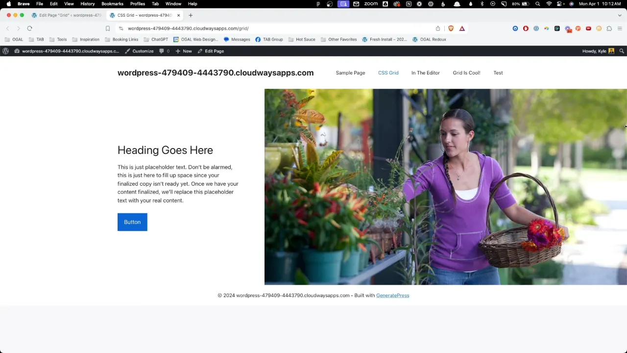
Demonstration of building a webpage from scratch using GenerateBlocks, focusing on setting up a CSS Grid. The structure includes a main container and nested containers for content and images, preparing for detailed layout adjustments. - 5:01
Styling of the page begins, detailing the arrangement of text and image containers side by side using CSS Grid. The grid setup allows for flexible adjustment of column sizes and spacing, ensuring the content aligns well with the overall design aesthetics. - 7:45
Deep dive into CSS for creating responsive layouts. This includes using grid template columns with min-max functions for dynamic padding and a fixed content width, allowing content to adapt to various screen sizes while maintaining alignment. - 11:06
Adjustments to ensure the layout matches the intended design, focusing on the alignment of content across different breakpoints. This section covers the technical setup to stretch content from the center to the edge of the screen using CSS Grid. - 13:05
Optimization for mobile responsiveness. The layout changes from side-by-side to stacked elements as the screen size reduces. Grid properties are adjusted to maintain usability and aesthetics on smaller devices, such as smartphones. - 16:21
Conclusion, reiterating the advantages of CSS Grid over Flexbox for complex responsive layouts. Encouragement for further exploration and practice with CSS Grid to better harness its capabilities in web design.
Official Documentation
When to Use CSS Grid in GenerateBlocks – Conclusion
CSS Grid not only simplifies the process of creating complex, responsive layouts but also provides finer control over the placement and spacing of elements. For WordPress developers using GenerateBlocks, embracing CSS Grid can improve the design capabilities of your projects, making it possible to implement designs that were once difficult or impossible with Flexbox.
