Ever wondered how to transform your blog into an interactive, dynamic, and visually stunning space? A One-Page Blog Design with Bricks Builder is your answer. Let’s embark on this creative journey to elevate your blog to the next level.
Prerequisites
Please make sure you have the following installed and activated:
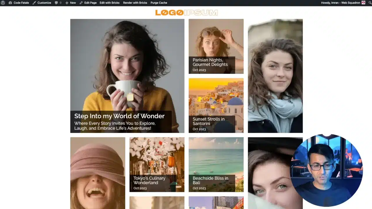
Setting Up the Hero Section
Summary
The hero section is your first impression. The video walks through setting up an eye-catching hero section.
Tips & Tricks
- Rename Your Sections
For better organization, always rename your sections. - Responsive Design
Use Bricks Builder’s preview feature to ensure your hero section is responsive.
Creating Blog Loops
Summary
Blog loops are crucial for displaying multiple posts. The video explains how to set up and customize these loops.
Tips & Tricks
- Offset Posts
Use the offset feature to skip over posts already displayed elsewhere. - Flex Wrap
Utilize the flex wrap feature for responsive design.
Customizing Layouts
Summary
The video discusses manipulating the layout and display of your posts, including setting specific widths and heights.
Tips & Tricks
- Consistent Sizing
Maintain consistent container sizes for a geometric and visually pleasing layout. - Query Feature
Use the query feature to control which posts get displayed.
Adding Quotes and Text Blocks
Summary
The video shows how to add quotes and text blocks, providing a break in the visual content and adding depth.
Tips & Tricks
- Text Alignment
Ensure your text is aligned for readability. - Font Choices
Choose fonts that are easy to read and complement your design.
Creating a Footer
Summary
Footers are essential. The video shows how to create a simple yet effective footer.
Tips & Tricks
- Social Links
Include social media links for better engagement. - Copyright Info
Add a copyright section to protect your content.
Making it Mobile Responsive
Summary
The video emphasizes the importance of making your blog mobile responsive and shows how to do it in Bricks Builder.
Tips & Tricks
- Breakpoints
Use breakpoints to customize how your blog looks on different devices. - Container Padding
Adjust the padding of your containers to ensure they look good on mobile devices.
Final Touches and Preview
Summary
Before publishing, preview your blog on different devices to ensure it’s fully responsive and visually appealing.
Tips & Tricks
- Browser Testing
Test on different browsers for compatibility. - Final Review
Do a final review to check for errors or inconsistencies.
One-Page Blog Design with Bricks Builder – Conclusion
Creating a one-page blog design with Bricks Builder is about creating a cohesive, interactive, and visually pleasing experience. With the right tools and some creativity, you can create something truly unique.
