Did you know there is a better way to set up a GenerateBlocks CSS Grid than using the predefined option? This method is offering a more streamlined and efficient way to design complex layouts without cluttering the DOM with extra elements. This tutorial will walk you through the process of setting up a GenerateBlocks CSS Grid, showcasing a better way to manage your site’s design.
Prerequisites
Please make sure you have the following installed and activated:
Advantages of Using CSS Grid over Predefined Grids
CSS Grid offers a level of flexibility and control that predefined grid systems can’t match. Here’s why it’s often a better choice:
- Customization
CSS Grid allows for precise control over the layout, enabling designers to create complex structures that predefined grids can’t accommodate without additional customization or hacky workarounds. - Responsiveness
With CSS Grid, creating responsive designs is inherently easier. Theauto-fitandauto-fillfeatures, along with theminmax()function, allow grid items to automatically adjust based on the viewport size without the need for media queries. - Simplicity and Efficiency
Using CSS Grid can simplify your markup by reducing the need for extra wrapper elements that predefined grid systems often require. This leads to cleaner, more efficient code and faster page loading times. - Future-Proof
As a web standard, CSS Grid is continuously supported and updated. Leveraging CSS Grid means adopting a solution that will evolve and improve over time, ensuring your designs remain at the forefront of web technology.
Instructions for a Responsive GenerateBlocks CSS Grid
- Open your WordPress editor and insert a container block with an inner container to your page.
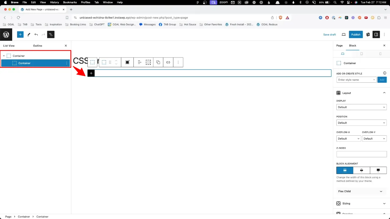
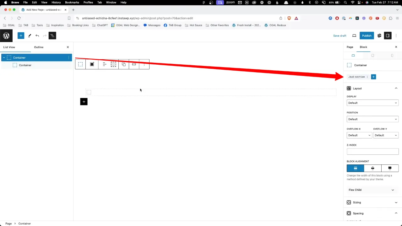
- Select the outer container and apply a custom class to give it some padding, enhancing readability (define the custom class to your liking).
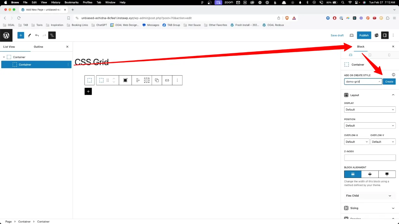
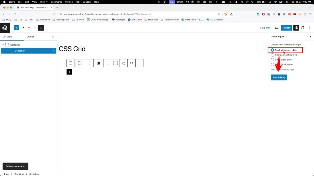
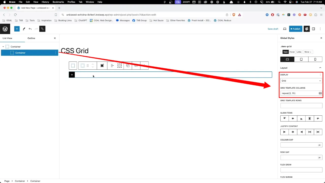
- Select the inner container and create an empty style (e.g. demo-grid).
- Select ‘Grid’ from the dropdown menu and choose your ‘Grid Template Columns’.
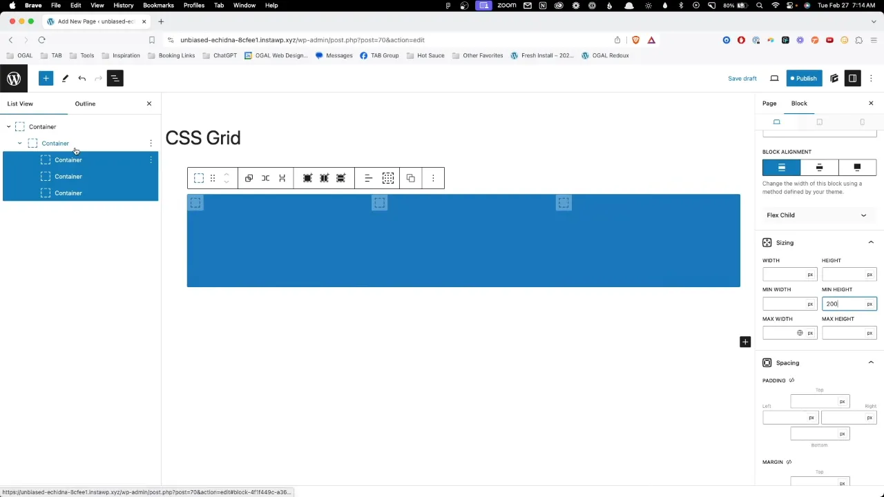
- Insert container blocks inside your grid container to act as grid items. You can style these for visual clarity.
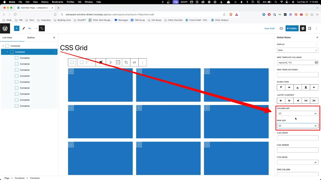
- Add column and row gaps to the inner container, e.g. 20px.
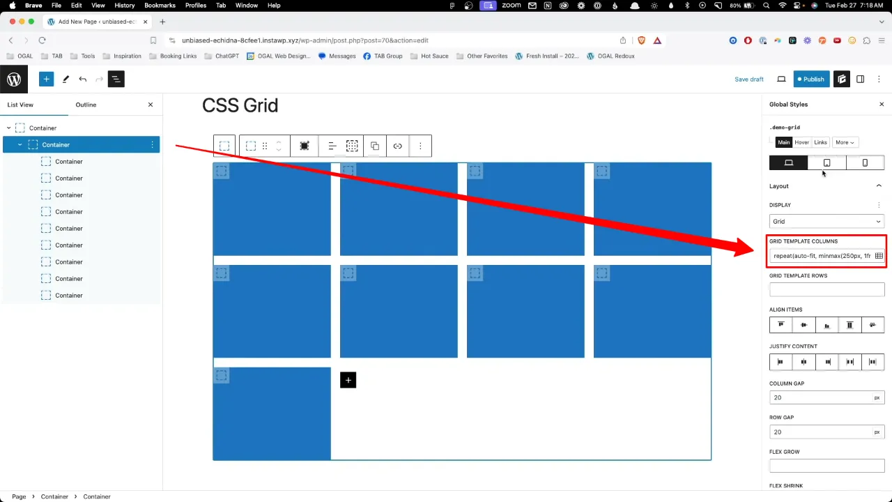
- To create a responsive layout, utilize the ‘FR’ unit and ‘minmax()’ function to define the size of your grid items. This will ensure that your layout adapts to different screen sizes seamlessly. You can add this for example via the ‘Grid Template Columns’:
repeat(auto-fit, minmax(250px, 1fr))
Official Documentation
GenerateBlocks CSS Grid – Conclusion
CSS Grid within GenerateBlocks offers a powerful and intuitive approach to crafting dynamic layouts in WordPress. By understanding and applying the basic principles outlined in this tutorial, you’ll be able to create versatile, responsive designs with ease. As you become more comfortable with CSS Grid, experimenting with its advanced features will unlock even greater potential for innovative layout solutions.
