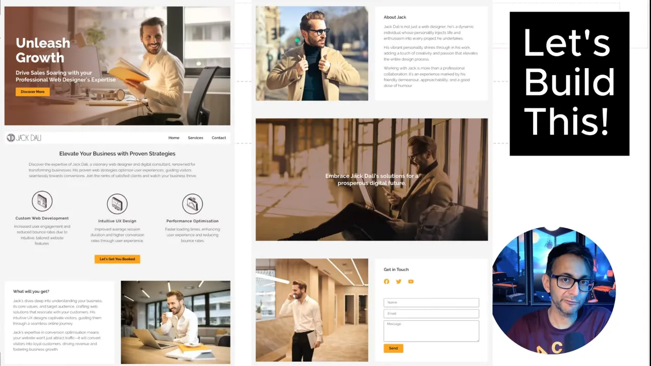
Creating an Elementor One Page Consulting Website can be a straightforward yet effective way to present your business online. In this tutorial, we’ll guide you through each step of building a one-page consulting website, ensuring you have a professional and responsive online presence.
Prerequisites
Please make sure you have the following installed and activated:
Elementor One Page Consulting Website Tutorial – Key Sections
1. Setting Up the Parent Container:
- Start with a new page.
- Create a flexbox container of 1140px width or as desired.
- Apply padding of 20px on the left and right sides.
2. Adding a Child Container:
- Insert a child container inside the parent for the background image.
- Set the child container to full width, considering the parent’s padding.
3. Background Image Settings:
- Apply a background image to the child container.
- Adjust the image settings to ‘no repeat’, ‘cover’, and ‘center right’.
4. Global Site Settings:
- Utilize the hamburger menu for site-wide settings.
- Choose a global color (e.g., F4F4F4) for the background.
5. Adding and Styling Elements:
- Insert headings and a button.
- Modify text, centralize items, and apply custom typography using REM units.
6. Advanced Typography:
- Use font clamp calculation for responsive typography.
- Adjust line height and color for readability and style.
7. Creating a Sticky Header:
- Add a logo and navigation menu.
- Use flexbox settings for alignment and spacing.
8. Building Additional Sections:
- Repeat the process for adding text, images, and other elements.
- Utilize flexbox for layout adjustments and responsive design.
9. Mobile Optimization:
- Adjust image sizes and container settings for mobile view.
- Ensure text and elements are responsive and legible on smaller screens.
10. Final Touches:
- Add contact forms and social icons.
- Ensure consistent styling across all sections.
Additional knowledge
- Understanding Flexbox
Flexbox is a layout model in CSS that allows for efficient and predictable layouts in a container. - Image Optimization
For better page speed, consider optimizing images before uploading them to your site. - SEO Considerations
Ensure headings (H1, H2) contain relevant keywords for better search engine optimization. - Custom Fonts
Uploading custom fonts can enhance your website’s unique look, but remember to optimize for load times. - Responsive Design
A responsive design ensures that your website looks good on all devices, from desktops to mobile phones.
Official Documentation
Conclusion
Creating an Elementor one-page consulting website involves setting up a parent container, adding child containers, customizing backgrounds, and ensuring mobile optimization. With a focus on flexbox for layout and typography, your website can be both visually appealing and functional across all devices.
